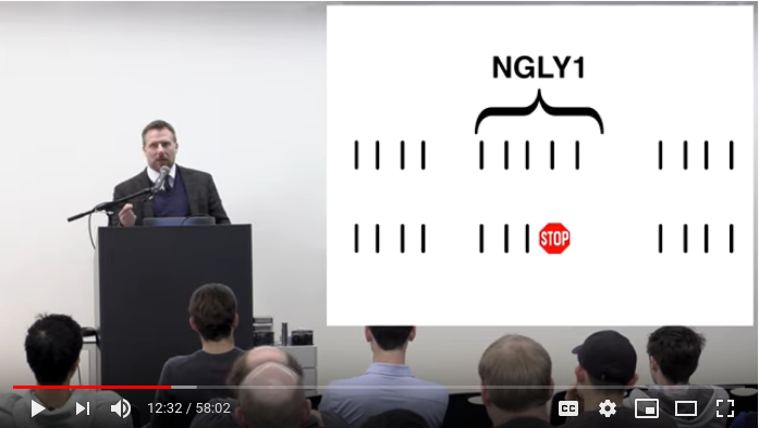

My job involves a lot of staring at large numbers, mostly latencies in nanoseconds, and picking out magnitudes like microseconds. I noticed myself constantly counting digits in my text editor, in my terminal, and in Jupyter notebooks in my browser.
I could have made specific solutions for each, but I thought “How could I solve this in the most general way possible?” and an idea came to me: I could make a font that uses fancy font shaping features to insert commas in all numbers, everywhere.
It was a fun idea, so I decided to play with it on my own time. After an evening reading documentation and a Sunday spent tinkering, I had it working! I’ve been using the resulting font at work for a few weeks now and it’s been a really pleasant improvement.
In this post I’ll describe the basics of OpenType shaping, how I used it to make a font that emphasizes digit grouping, and how I extended it with even fancier variations.
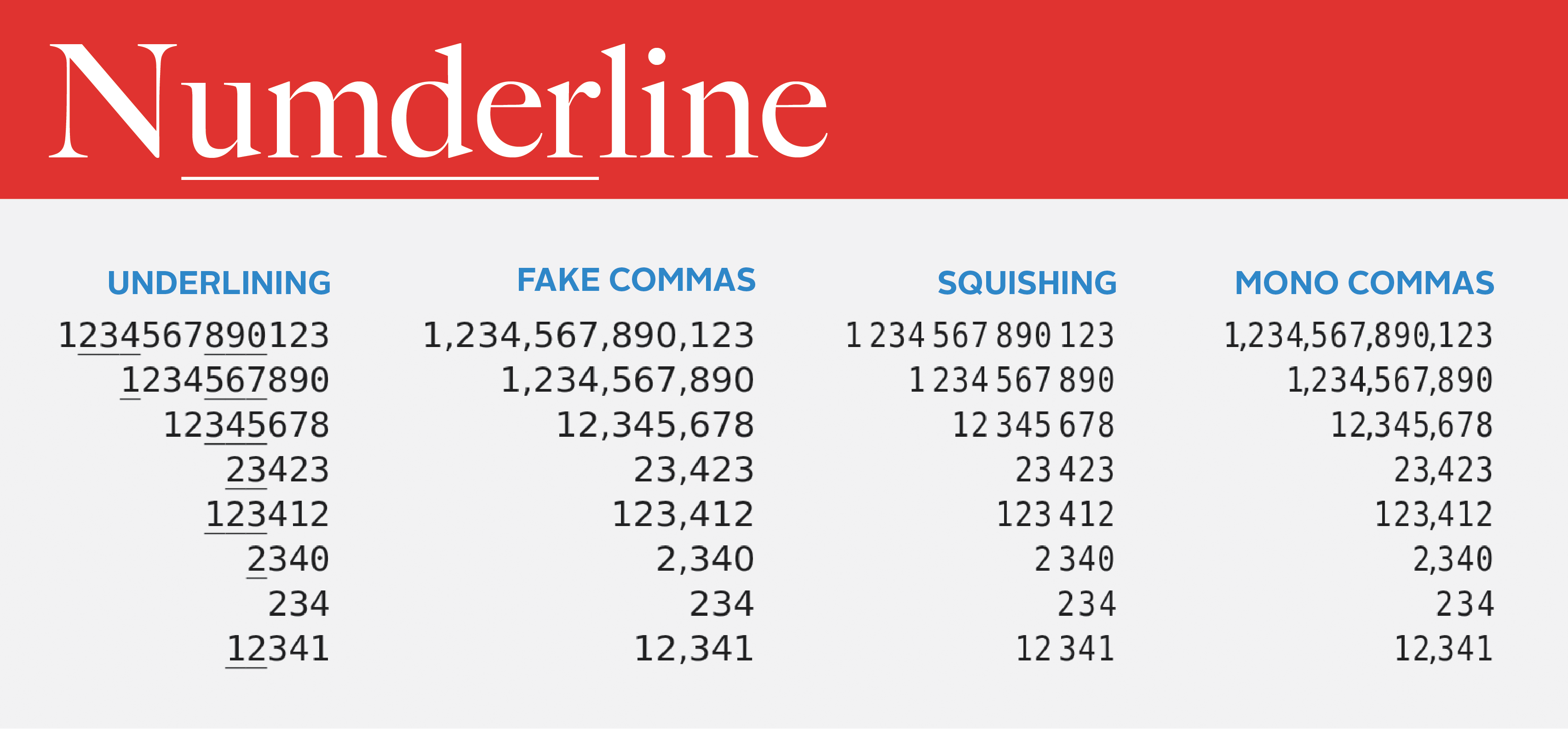
I call it “Numderline.” Below you can see a preview of the main variant. For more samples or to download the font, see here, or read on.
Learning how font shaping works
I knew that font shaping was extremely powerful and driven by “tables” inside fonts, but I had no idea what the tables were like and how the process of shaping worked. So I found the OpenType specification and learned that the word “table” is used in a very loose sense just to refer to some defined binary data structure.
Font shaping is the process of mapping a string of unicode text (using the “cmap” table) to a sequence of “glyphs.” Those glyphs have various substitutions applied to them, for example turning the sequence “ட,ு” into the “டு” glyph, the substitutions coming from a multi-level hierarchy in the “GSUB” table. Then, the positions of the glyphs are adjusted using information in the “GPOS” table, for example to place accent glyphs in the correct location. The final result of font shaping is a sequence of positioned glyph IDs, which is rendered on your screen using the information in the “glyf” table on the shape of each glyph (usually caching a rendered version of each glyph in an “atlas” for efficiency).
GSUB seemed like the table I wanted, but as I read through its various substitution types, I became worried my plan wouldn’t work. They all seemed to work forward through the text, whereas I needed to count digits backwards from the end of a number! Luckily at the very end of the list I found the feature I needed, intended for shaping Arabic calligraphy: “Reverse Chaining Contextual Single Substitution.”
Substitution rules work a bit like a limited form of regular expressions. You provide “classes” of glyphs, which are basically just lists of glyph IDs. Reverse chaining substitution matches zero or more backtracking classes: a single class for the glyph to be replaced, then zero or more lookahead classes. If it matches, it substitutes using a mapping table, which provides a replacement glyph for every glyph in the matching class. If multiple reverse chaining substitutions are provided, they can all chain with each other.
At first I thought I might need to build these binary tables by hand, but after some more research I discovered that font designers often use a language defined by Adobe called “feature files,” which compiles down to OpenType tables.
Here’s an example of what a feature file looks like. It makes strings of vowels alternate in capitalization, starting from what they were on the right:
# Tell OpenType to use a system with fancy shaping features for latin characters
languagesystem DFLT dflt;
languagesystem latn dflt;
# Classes can be given names and you can reference glyphs by name
@lowercase=[a o e u i];
@uppercase=[A O E U I];

# Substitutions are put under "features", which have different capabilities.
# The one I use is "contextual alternates", which is enabled by default
# and allows contextual substitutions.
feature calt {
    # Matches a lowercase followed by a lowercase and replaces it with
    # the corresponding uppercase version, and vice versa.
    # The ' signifies the glyph in the pattern to be substituted.
    # This turns AoeUI into AoEuI
    reversesub @lowercase' @lowercase by @uppercase;
    reversesub @uppercase' @uppercase by @lowercase;
} calt;
Using the knowledge
I realized that instead of inserting commas, I wanted to underline alternating groups of 3 digits so that the font would work in monospace contexts. This would require keeping track of each digit’s position from the right of the number modulo 6. Unfortunately the only way to keep track of state is by replacing glyphs: notice how in the above example we effectively count modulo 2 by matching on the case (state) of the glyph on the right and ensuring the alternating uppercase/lowercase pattern continues.
So I needed to make six copies of each digit glyph, corresponding to the six possible states. For instance I would have six different “4” glyphs, each with a different glyph ID that I could match on separately, with the first three glyphs looking normal and the last three having an underline. My feature file would have six class definitions for each set of the digits 0-9, and my substitutions would substitute one class for another based on the class it matched from the right.
I looked up how the Powerline font patcher worked and read the FontForge API documentation. I modified the patcher to make multiple copies of each digit glyph and to use string templating to generate a feature file with class definitions that reference the different sets of copies followed by substitutions that use them.
I then needed a way to test the resulting font, but I didn’t want to have to reinstall the font constantly and worry about stale caches. I ended up using a test web page which loaded the font as a web font.
I implemented the counting modulo six using “reversesub” rules, but the FontForge API segfaulted when I tried to compile the feature file! It turns out there’s been an open issue about this for years but “reversesub” rules are so infrequently used that it hasn’t been fixed. So I switched to using fontTools to add in my feature files, and it worked!
Now I just needed to modify some of the copies of the digits to display the digit grouping. In order to add the underline I found the underscore glyph and pasted it on top of the digit copies corresponding to 3 to 5 mod 6 from the right. When used on a font with a sufficiently wide, low, and thin underscore like DejaVu Sans Mono, these alternating groups of 3 underlined digits looked reasonably pleasant.
Improvements
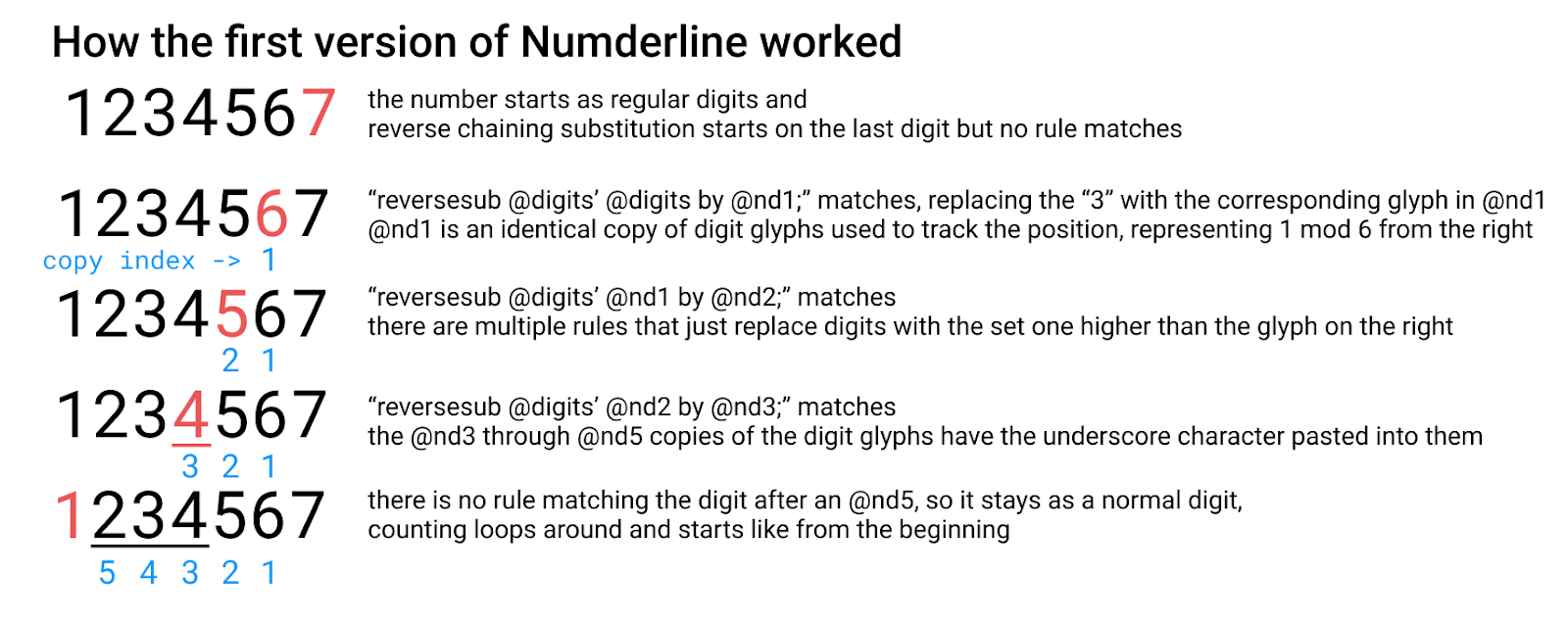
I had accomplished my basic goal, but I still had other ideas. I modified the feature file code so that it wouldn’t touch numbers less than 4 digits, and it numbered digits after the decimal place left to right instead of right to left. I also added a debug mode that pasted the index of the copy under each glyph in the copied digit set to visualize how the font was working:
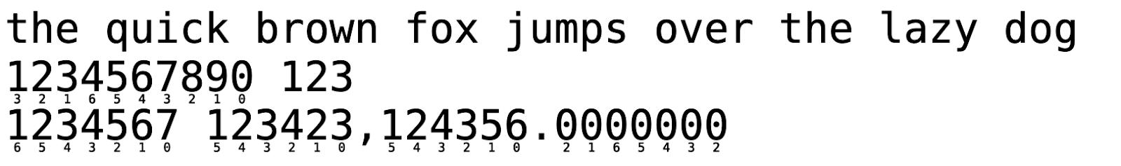
Note that there’s a “6” copy that’s different from the “0” copy. This was so that I could implement my original goal of inserting commas by pasting the comma next to the correct digit, but without having a comma to the right of the number, or to the left of 3 digit numbers. I also made grouping digits after the decimal point optional so that inserting commas didn’t look as weird.

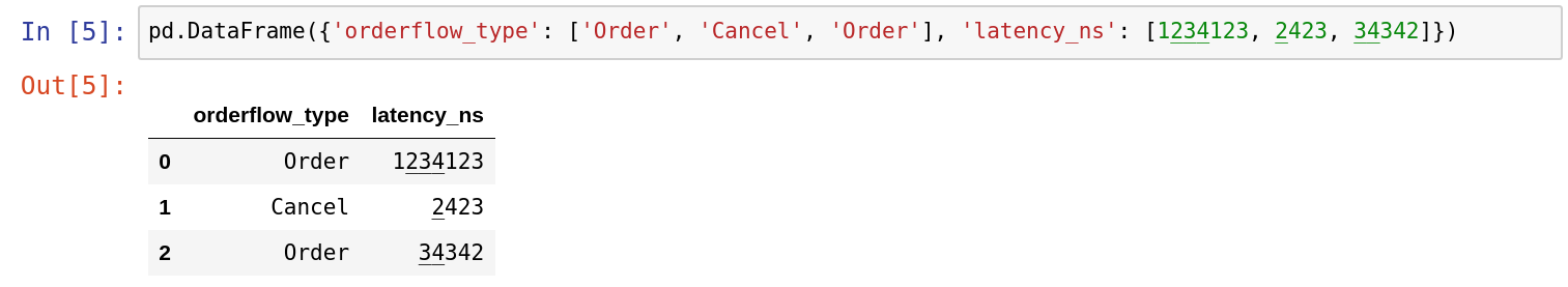
The underlying text above has no commas and that selection is one character! A friend suggested I try squishing groups of 3 digits together, so I tried that as well, by scaling and translating different copies in different ways:
And then I combined it with the commas to make a version that can insert commas even in monspace contexts:
After all these improvements my final feature files looked like this:
languagesystem DFLT dflt;
languagesystem latn dflt;
@digits=[zero one two three four five six seven eight nine];
# class definitions for all my copies of the digit glyphs
@nd0=[nd0.0 nd0.1 nd0.2 nd0.3 nd0.4 nd0.5 nd0.6 nd0.7 nd0.8 nd0.9];
# [clipped] lines for @nd1 through @nd5 ...
@nd6=[nd6.0 nd6.1 nd6.2 nd6.3 nd6.4 nd6.5 nd6.6 nd6.7 nd6.8 nd6.9];

feature calt {
    # Number glyphs after a period left to right by forward chaining off an @nd2
    sub period @digits' by @nd2;
    sub @nd2 @digits' by @nd1;
    sub @nd1 @digits' by @nd6;
    # [clipped] lines for @nd5 through @nd3 ...
    sub @nd3 @digits' by @nd2;

    # Only convert numbers with at least 4 digits
    sub @digits' @digits @digits @digits by @nd0;
    # Chain to mark rightmost digit as @nd0
    sub @nd0 @digits' by @nd0;

    # Chain in reverse from the rightmost @nd0
    reversesub @nd0' @nd0 by @nd1;
    reversesub @nd0' @nd1 by @nd2;
    # [clipped] lines for @nd3 through @nd5 ...
    reversesub @nd0' @nd5 by @nd6;
    reversesub @nd0' @nd6 by @nd1;
} calt;
Using it at work
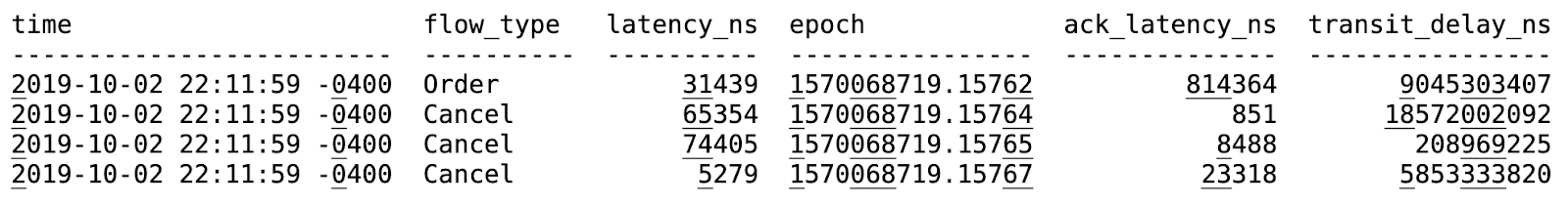
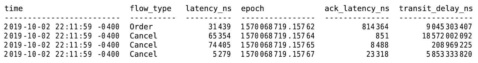
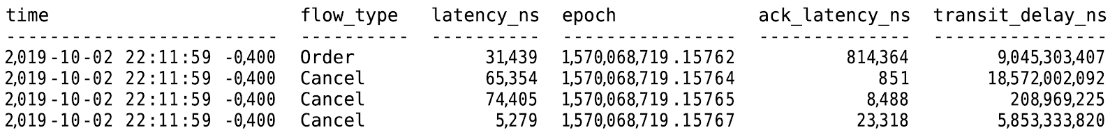
At work I used the StyleBot Chrome extension to inject custom CSS in my Jupyter notebooks, which made my Pandas tables right-aligned, and used my font, so that I could now more easily parse the columns of large numbers. I also switched to the Kitty terminal, one of the few that supports font shaping, and set it up with my font so that I could use it with Jane Street’s command line data retrieval tools.
Unfortunately I couldn’t use it in my text editor since Emacs doesn’t support font shaping, and while Sublime Text 3 does, it has an optimization where it doesn’t apply font shaping to alphanumeric characters to save space in the shaping cache.
I’ve been really enjoying it for the couple weeks I’ve used it – it makes visually parsing tables easier, and in my Jupyter notebooks, even though Python 3 now supports underscores in numbers, I don’t need to manually add them and update them when I change a number anymore. My font makes them obsolete.
I’ve also gotten lots of interest in using the font from my coworkers, because it turns out many people at Jane Street spend time staring at various types of large numbers.
Conclusion
You can preview the various versions of the font at https://thume.ca/numderline/ and download pre-patched versions of some selected fonts, or look at the source and use the patcher yourself.
On the one hand, this whole project seems like a hack which uses font shaping for something it’s not intended to do, but on the other hand I think that font shaping is the natural place to apply stylistic features that make text easier to read.
Over the years, as font shaping has rolled out more advanced features and made more languages display better in more places, I think it was a failure of imagination to not improve the display of English text and numbers as well. I think digit grouping should always have been the job of font shaping. Indeed, it is the programming languages and style guides suggesting you insert commas and underscores every three digits that are the hacky workarounds!
I think this is a great example of what can be accomplished by knowing all the parts of a system so that you can find the best place to implement something. Notably, I didn’t need to understand how OpenType shaping worked to come up with the idea. I just had to know it existed and have an idea of what it was capable of, so that I knew to go research it further.
My work is in performance engineering, where understanding the basics of how the entire system works end to end, then diving deep and learning about some overlooked area, is a great way of finding potential optimizations. Nearly every day I spend time learning about a new part of a system, or profit from past learning by coming up with an idea based on some thing I vaguely remember reading years ago. I think it’s really valuable to constantly learn about interesting things just outside your usual domain so that you can realize when they might be applicable after all.